- WAS [the newsletter]
- Posts
- WAS THE NEWSLETTER #96
WAS THE NEWSLETTER #96
GET TO KNOW TOIA STUDIO
#96
I’m Paige Wassel. WAS the Newsletter is your weekly dose of design inspiration, where great collabs make even better design.
ABOUT A BRAND
When Kate and I started Office Supplies, we realized we needed branding. Even though we’re both design people, we didn’t have the time to figure it all out on our own. Also… we just aren’t graphic designers lol
We wanted branding that felt as tongue-in-cheek as our name… but we also wanted it to be genuinely good. Like, “this could be a real corporate entity, but also maybe it’s a kind of a bit?”
Enter Toia Studio, the Mexico City design duo of Eduardo and Victoria. They immediately understood the assignment when they pitched us their vision. From the first call, we felt like they were our people. We loved that they were sharp, curious, and somehow able to take the whole mood of “The Office meets Italian retro design” and turn it into an actual brand system that feels equal parts iconic and hilarious.
They built us a full identity with logos, in a perfect red, cream, and black color palette. They gave us a brand voice, which created a psychological backbone for who we are as a company. Whoa.


Instead of just handing over pretty graphics, they provided a full playbook so we could carry the look across everything from window decals to a glowing lightbox sign. Plus, they gave us choices, which is everything.
 |  |
Toia’s approach is thoughtful, research-driven, and heavy on personality. They treat branding like therapy in the best way, digging into the soul of a business until its voice and visuals actually make sense. We loved working with them, and not just because they made us look good. (Seriously, how good did they make use look?!)

 |  |
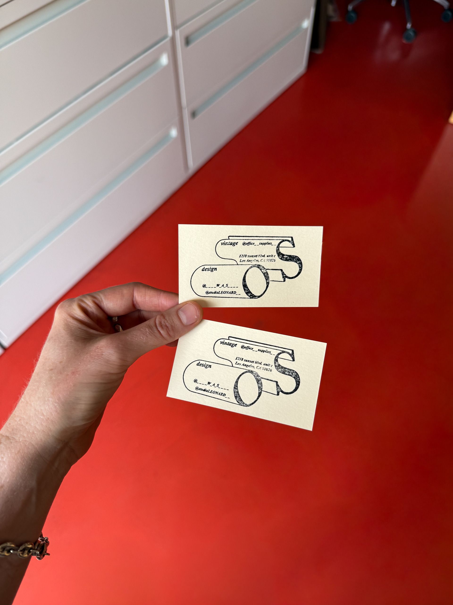
What’s so cool is that for our business cards, we decided to go with a stamp they designed instead of ordering a big pre-printed stack. We wanted the flexibility to evolve as the business grows, and honestly, it just felt more in line with our scrappy, resourceful vibe. Now we can stamp on heavy cardstock whenever we need a card, but this leaves us free to switch things up if we move or update info. Plus, it just keeps things tactile and fun.
I’m stoked to share our convo with the team behind the Office Supplies identity today. Victoria and Eduardo discuss their process, what inspires them, and why they believe good design should always surprise you. So LFG!
THE INTERVIEW
Tell us a little bit about your background—where are you based, and how did Toia Studio come about?
Victoria and I were both born and raised hardcore Mexico City. We went to the same university—Vic studied graphic design and I studied communications. But it wasn’t until two years after graduating that we met in a digital marketing agency, where we had to learn a lot for ourselves and together by creating designs and brandings for the first time. We had great synergy and were close. Then, Edi left for Europe to study a master’s in Design Management, and Vic went to Austin, and then did an Arts master’s in Japan, too, so we lost touch. But we regained communication after Edi came back to Mexico seven years later, as Vic did her own thing, too. We worked on a few projects together and ended up partnering in this beautiful, sometimes chaotic dream called Toia.
How would you describe your studio’s style?
It’s creative, research-based, intuitive, and sensible.
We’re inquisitive, witty, passionate, and enjoyable. We love laughing and enjoying the process, imagining things and taking ideas into very far universes that sometimes don’t occur, but that help us understand the client, the industries, its audiences, and the graphic voices in between.
If we don’t have fun, we suffer, which is something we need to work on, but usually we find ourselves enjoying most of the process (like we honestly did for OffSupps).
We love what you’ve created for Office Supplies! What was the inspiration, and how did you land on the final designs?
We took Office Supplies seriously and humorously as well, kind of grabbing the satiric tone that Paige and Kate explained to us when first approaching the project. It made us think of “The Office” but in the realm of graphic and communication, without making it satirically useless, of course. So we delved deep into hardcore American corporation language—the visuals, the language, the letterheads, the emails, the formats.
Then we also took a look into more design/cool—inspired aesthetics with similar large scale business tones like Herman Miller, Kartell, Cassina… we grabbed a bit of both so that we could have a very solid, identifiable corporate office structure with some unique distinctive elements that could visually sprout out of that structure and relate to a more visually creative (yet aligned) essence that is, in fact, the soul and heart of Office Supplies personality: the isotisotype, the logo itself with a retro italian design business spirit, the color red, etc.

When you’re working on building the design for a brand, what does your process look like?
It all starts with a psychological analysis of the situation. We often feel a lot like therapists before anything else… especially for small-scaled projects where businesses are so closely tied to the owners’ desires and personalities that we want to understand it, and respect it, but also create a separation. Then we move to the facts. Who it is for, what does the world around this business look like, and how does this project want to look and sound like—that’s where research takes place.
When we have that, we create a concept. If that concept clicks with the client, we then move into the graphic part. The concept of the branding is the backbone of the project: how it sounds, who it speaks to, its personality, what it wants to show and achieve… and then that works as a check-box for the graphic part. It all has to resonate with the concept; otherwise, it’s discarded. That’s more or less how it goes.
What’s inspiring you right now? Where do you go to find inspiration?
Tough question to put into words… but being surprised. We believe in contributing to the world with surprising, striking (in a small, psychological scale) ways through design and words. Telling small stories, sending out small messages that might make someone’s head turn around, and rethinking something as “inconsequential” as a vintage store turns into something that generates curiosity, raises an eyebrow. For us, it’s a satisfying effect of good design—no aspiration to change the world, nothing but generating positive and curious, witty surprises in other people that we are crazy about.
What’s a favorite project you’ve worked on? Would love to see any past work!
I guess Carmin Bar in Mexico City. We worked closely with the interiorism, the colors, the brave unapologetic personality. Its main character: a Mexican “diablito” fissioned with a pan into a single element that condenses the place’s personality. The colors, the old fashioned, Luca-Guadagnino aesthetic inspired place. We’d recommend taking a look at it. The place is beautiful, too.
 |  |

THANKS AGAIN Toia Studio! WE HEART YOU <3
xx,
P