- WAS [the newsletter]
- Posts
- WAS THE NEWSLETTER #63
WAS THE NEWSLETTER #63
I <3 Paloma Elsesser's AD Tour
Maren Loveland
February 07, 2025
#63
I’m Paige Wassel. WAS the Newsletter is your weekly dose of design inspiration, where shockingly, sometimes we love it all.
THE VIDEO
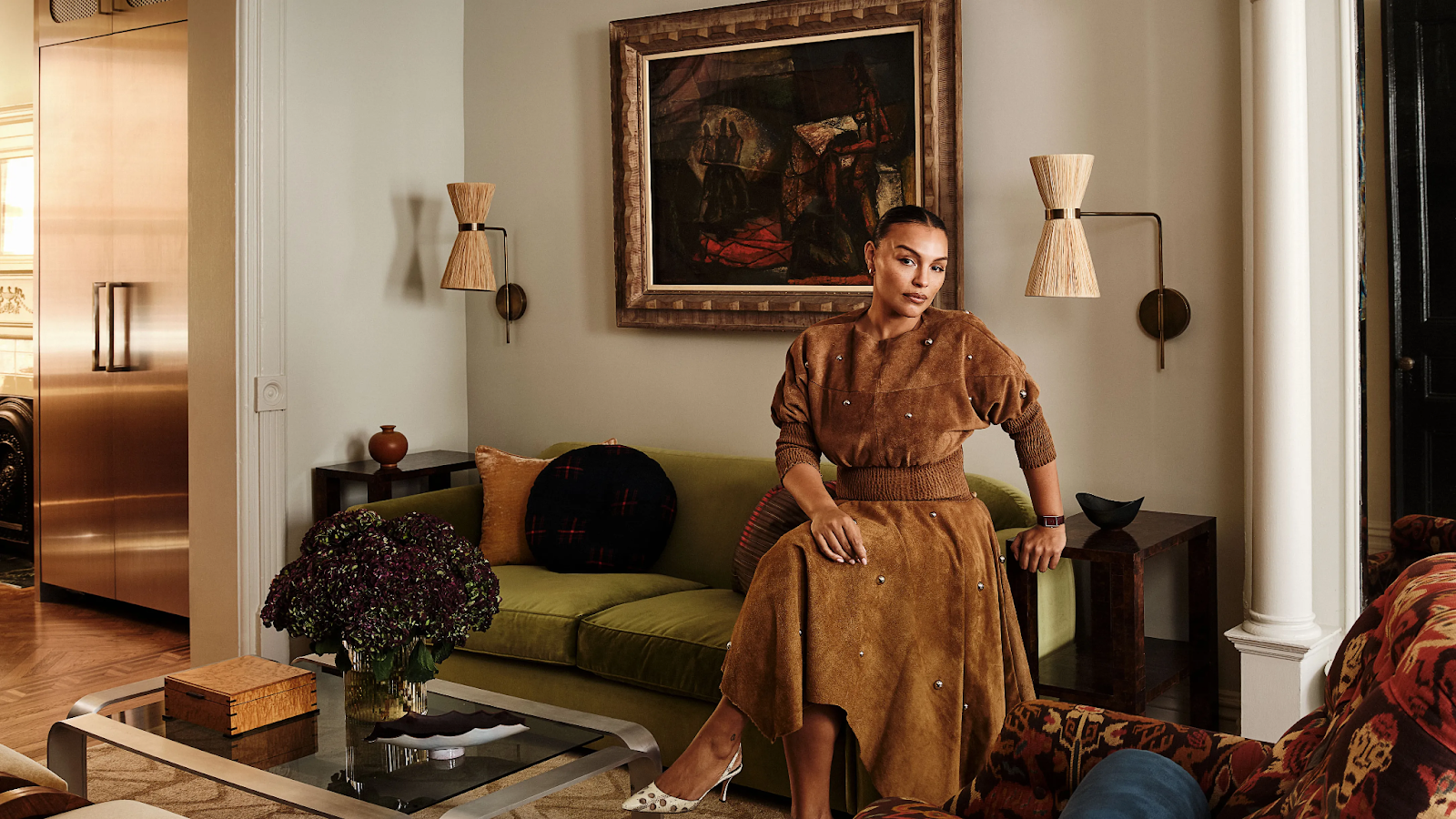
I just did a home review of the AD spread on model Paloma Elsesser’s Brooklyn brownstone. Her place was done in collaboration with Gregory Rockwell Interiors, a design and art consultancy firm.
You can tell this is one of those instances where the homeowner was involved with all the choices, and the designer brought that vision to life, as there’s such a distinctive POV. When you have an involved client and a great designer, that’s where the magic happens. This place is so cohesive, so eclectic, so personal.
Now, you’re probably waiting for me to talk a little smack, but… the smack is minimal. This home aligns more with my taste than any other tour I’ve ever seen on AD. Troye Sivan was #1 and now we have a close contender. Are there a few things I’d have done differently? Sure. But make no mistake, this home is just lovely.
Let’s Go Room by Room
First, Paloma has the living room defined into two zones, with the fireplace used as an art piece that divides it. Absolutely yes.
Here’s the chill lounge area where you could read or gather or spy on the neighbors (no judgment), with fantastic textile art.

What really works for me is the space-age shape of the couch, and especially the speakers. Touch of tech remember?
The other half is a TV area. In the video, you’ll see that the television is nicely incorporated into the bookshelf so it’s not dominating the room.
I am so into the oil painting with the gold frame and I love how nothing overshadows the architectural elements of the room, like the amazing crown molding. Do I die for the rug or the lamps? No, but I might for the stools on the other side of the coffee table.
The dining area is Paloma’s favorite spot in the house. I love the art piece and how she turned the couch into a banquette sort of situation. The wooden chairs are striking, but I wonder how comfortable they are, because I am all about the comfortability of everything, especially if you’re going to sit and gather for hours.

I feel like there’s something I don’t like about the window treatments, but at the same time, I do like them. Ultimately, the room gives me feelings, that design high.
Now here is a restful and muted primary bedroom that makes the architecture the star of the show.
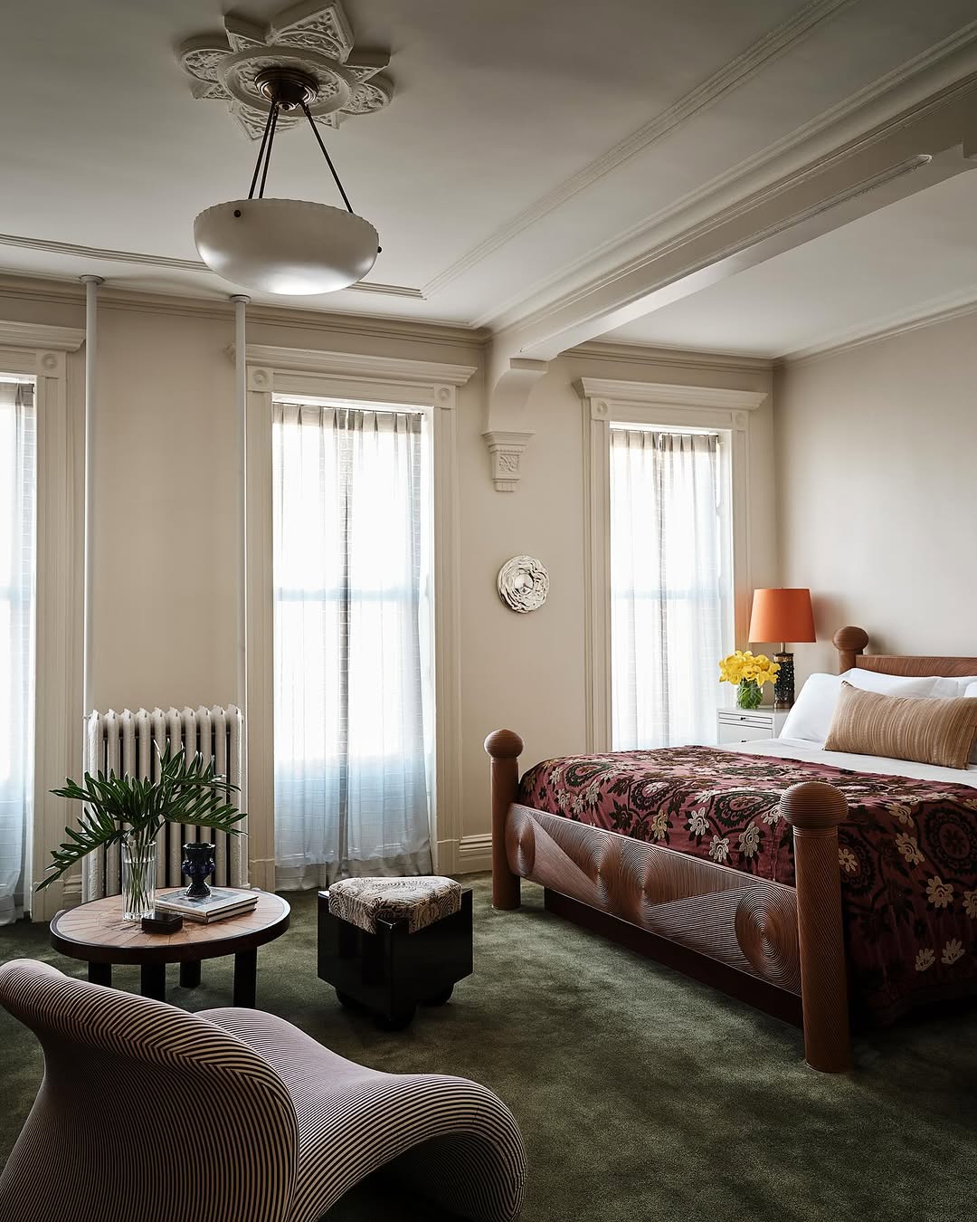
What I like about this is in a home with so much design going on, it’s nice that some areas are a little more standard. And I say I’m not always a carpet person, but that’s not exactly true. I’m a hard wood person if the carpet isn’t great. But I am a carpet person when it’s luxe, such as we see here. I said carpet one too many times and now the meaning is twisting lol
Here’s the media room, which is just a dream.
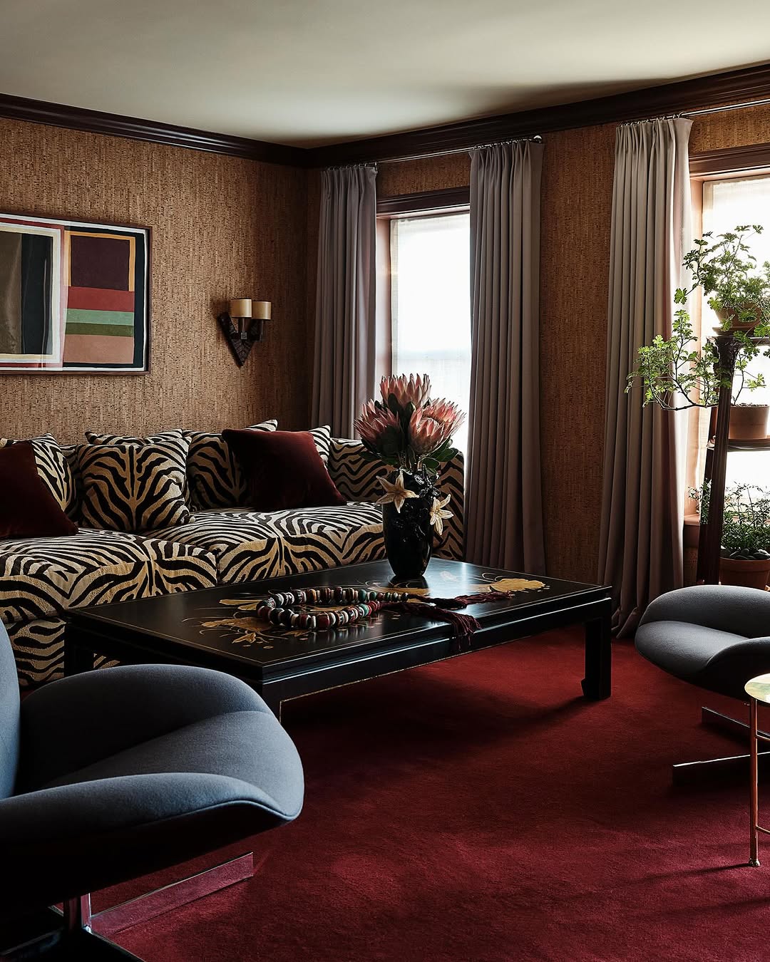
Again, great carpet and those cork walls! Plus a deeeeep couch that’s got to feel like a bed. Some of you may take issue with more than one TV area in the house, but not me. More is more and sometimes you just want to have something on in the background without going to one formal spot to watch your show. (Would I paint the ceiling to make it even more cozy? Probably. But it’s totally okay they didn’t.)
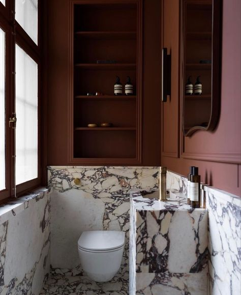
In the video, there’s a jewel box of a powder room under the stairs. But the big dance is the primary bathroom.
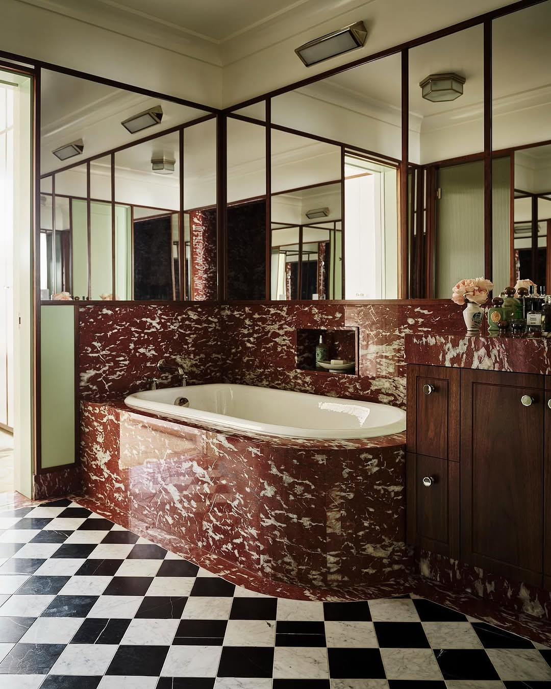
There’s so much greatness going on in this bathroom. The mirrors, the mix of marbles, just all of it. I love that instead of stripping the history of this home, they embraced it. This doesn’t look like just any upscale bathroom you’d encounter in a Four Seasons hotel, whether it’s Cleveland or Atlanta or Denver. This space has a distinct personality and a real sense of place.
You walk through the bathroom to get to the massive closet area.
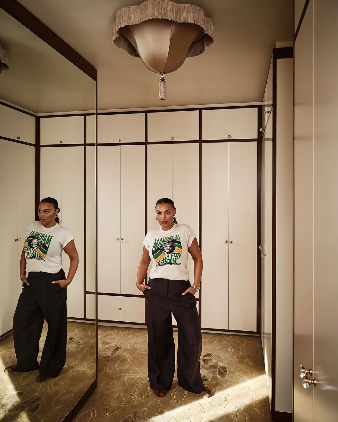
I mean, this is like a private shopping experience at a high-end department store. The plush carpet, the contrasting finish on the doors, all of it. Enthusiastic yes.
And while this isn’t the whole house—do check out the video—I love this entry hall.
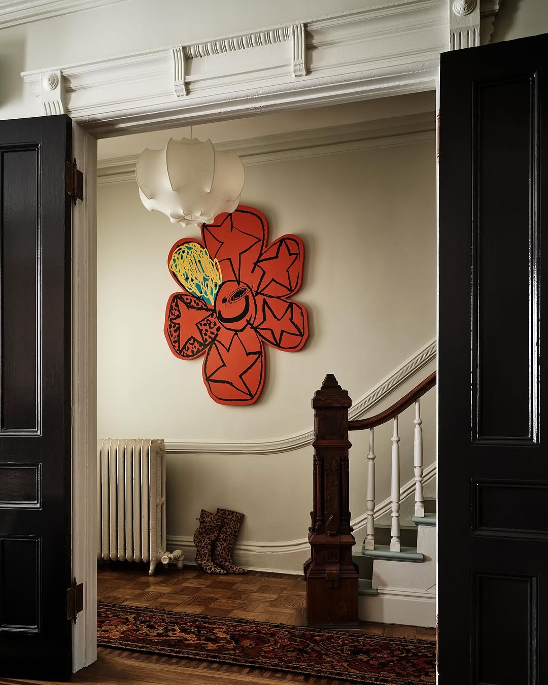
The juxtaposition of the traditional stairwell and the funky daisy pop-art is such a good mix. It’s just so good.
What I love about home tours like this is the inspiration it gives. Like, maybe the Schumacher fabric is out of your budget, but I bet you can find something that can give you that look for less. And half the fun will be finding it.
So I hope you loved this home review as much as I did. Everything here is going to age nicely and the mash-up of old and new is veryyyy gewwwwwd.
KATE’S PAINT COLOR OF THE WEEK
Benjamin Moore: Charlton Brown
Finish: Any
Room Light Level: Mid to Low

Check out Kate’s paint consultation business here!
xx,
P